
Table of Contents
◉ Introduction ◉ Reader Roadmap ◉ Brand Identity Is More Than a Logo ◉ What Is Looka? ◉ Step-by-Step: How to Create a Brand Identity with Looka ◉ Pros and Cons of Using Looka for Brand Identity ◉ Common Mistakes and Troubleshooting ◉ FAQ ◉ Conclusion ◉ Sources
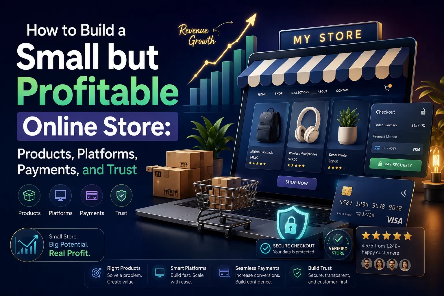
A strong brand identity is no longer something only large companies can afford. If you are launching a startup, side hustle, consulting practice, YouTube channel, online store, local service business, or personal brand, your audience will often judge your credibility before they read your offer in detail. Your logo, colors, typography, social graphics, website visuals, and business materials create that first impression.
That is where Looka fits into the modern branding workflow. Looka is an AI-powered design platform that helps users create logos, brand kits, marketing assets, business cards, social media materials, and websites without needing formal design training (Looka, 2026). It is especially useful for entrepreneurs and small teams that need a polished visual identity quickly but are not ready to hire a full branding agency.
In this guide, you will learn how to use Looka strategically—not just to make a logo, but to build a usable brand system. You will also learn where AI branding tools are helpful, where human judgment still matters, and how to avoid the most common mistakes that make DIY brands look generic.
Reader Roadmap
• What brand identity really means: You will learn the difference between a logo and a complete visual system.
• How Looka works: You will understand what the platform can generate and where it fits in a small-business workflow.
• Step-by-step branding process: You will get a practical walkthrough for creating a logo, brand kit, and launch-ready assets.
• Mistakes and troubleshooting: You will learn how to fix weak logo concepts, inconsistent colors, poor readability, and generic-looking designs.
• Decision guidance: You will see when Looka is a smart choice—and when you may need a professional designer instead.
• Launch checklist: You will leave with a clear action plan for using your new identity across your website, social profiles, and marketing materials.
Brand Identity Is More Than a Logo
A logo is important, but it is only one part of brand identity. Your brand identity is the visual and verbal system people associate with your business. It includes your logo, colors, fonts, imagery style, tone of voice, layout patterns, social templates, website look, packaging, presentations, and even the way your email signature appears.
Think of your brand identity as a consistency engine. It helps people recognize you faster and understand what kind of business you are. A clean financial consulting brand might use structured layouts, restrained colors, and confident typography. A children’s learning app might use warmer colors, rounded shapes, and friendly illustrations. A premium skincare brand might rely on minimalist spacing, soft neutrals, and elegant fonts.
This matters because visual communication is now part of everyday business performance. Canva’s 2025 visual communication research reported that 84% of respondents said poor visual communication causes delays and confusion, and the company estimated that the U.S. visual content economy receives $143 billion in annual investment (Canva, 2025). Even if you are not running a design department, your business still competes in a visual environment.
The diagram above should show why this distinction matters: a logo is the anchor, but the full brand identity is what makes your business recognizable across every customer touchpoint.
What Is Looka?
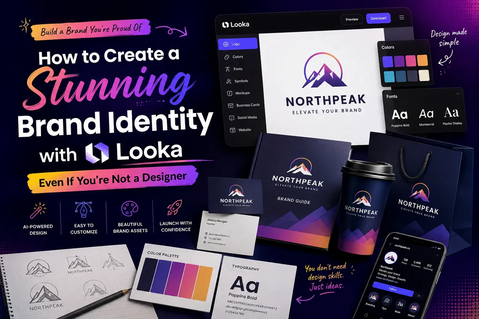
Looka is an AI-powered branding platform built for people who want to create a professional-looking identity without starting from a blank canvas. According to Looka, its logo maker combines your design preferences with artificial intelligence to generate custom logo options, and its Brand Kit can turn your logo, colors, fonts, company details, and industry visuals into branded templates (Looka, 2026).
The platform is designed around a guided process. Instead of asking you to manually draw shapes or select every design element from scratch, Looka asks for inputs such as your business name, industry, preferred styles, colors, symbols, and layout preferences. It then generates logo options that you can customize.
Looka also states that users can generate logo ideas for free and pay only when they decide to download and use a logo (Looka, 2026). That makes it practical for early exploration, especially when you are still testing business names, visual directions, or niche positioning.
Looka is not only a logo generator. Its broader value comes from the Brand Kit, which Looka describes as a way to access 300+ branded templates, create marketing assets, build a website, and launch a business using your selected logo, colors, and fonts (Looka, 2026).
Why AI Branding Tools Are Useful for Non-Designers
The biggest advantage of using a tool like Looka is not that it “replaces” design thinking. It is that it reduces the friction of getting started.
Many founders and creators delay launching because they get stuck on visual identity. They open a blank design file, try a few fonts, dislike everything, and postpone the launch. Looka solves that blank-page problem by giving you structured options quickly.
AI-powered branding tools are also part of a bigger shift in small-business technology adoption. A 2024 U.S. Chamber of Commerce and Teneo study found that 98% of small businesses were using at least one AI-enabled tool, while 40% were using generative AI tools such as chatbots and image creation tools (U.S. Chamber of Commerce, 2024). The practical takeaway is simple: small teams are increasingly using AI to save time, reduce costs, and compete with larger organizations.
For branding, that means you can move from vague ideas to usable visual directions faster. You can compare multiple logo concepts, test color combinations, generate social templates, and create a basic launch kit without hiring several specialists.
However, the strongest results still come from human judgment. AI can generate options, but you decide whether the identity fits your audience, positioning, and long-term business goals.
Before You Start: Define Your Brand Strategy First
Looka can help you create assets, but it cannot decide your business strategy for you. Before you generate logos, answer a few simple questions.
• Who are you trying to attract?
• What problem do you solve?
• What should people feel when they discover your brand?
• Are you aiming for affordable, premium, playful, expert, bold, calm, local, modern, traditional, or innovative?
• Where will your brand appear most often: website, Instagram, LinkedIn, packaging, business cards, app icon, YouTube thumbnails, or physical signage?
These answers will make your design choices sharper. For example, a cybersecurity consultant and a wedding photographer should not make the same font, color, and icon decisions. One needs trust, precision, and authority. The other may need warmth, emotion, and elegance.
A good brand identity starts with positioning. Looka can speed up the execution, but your positioning gives the visuals a clear direction.
Step-by-Step: How to Create a Brand Identity with Looka
1. Start with a clear business name and category
Go to Looka and begin by entering your business name. If you are still deciding on a name, use this stage for exploration rather than final production. Looka also offers business name tools, which can be useful when you are brainstorming.
Choose the industry category that best represents what you do. This helps the platform generate more relevant symbols, layouts, and design directions.
Sub-steps:
• Use the simplest version of your name.
• Avoid adding legal suffixes like “LLC” unless they are part of your public-facing brand.
• Test how the name looks in uppercase, lowercase, and title case.
• Check whether the name is easy to read at small sizes.
A common mistake is choosing a name that looks interesting in large text but becomes confusing in a small logo, favicon, or social media profile image.
2. Choose visual styles that match your audience
Looka’s process asks you to select logos or styles you like. Do not choose only what looks cool in isolation. Choose what fits the customer perception you want.
For example:
• A SaaS productivity tool may benefit from clean, modern, geometric styles.
• A wellness studio may need softer colors, spacious layouts, and organic shapes.
• A home repair business may need bold, readable typography and a practical symbol.
• A personal finance brand may need a balance of trust, clarity, and approachability.
The goal is not to impress other designers. The goal is to help your ideal customer immediately understand what kind of experience your brand offers.
3. Pick colors with meaning, not just preference
Color is one of the fastest ways to shape brand perception. But many non-designers pick colors based only on personal taste. That can lead to a mismatch between the brand’s visuals and the audience’s expectations.
Use these practical rules:
• Choose one primary color that represents your core personality.
• Choose one or two supporting colors for contrast and flexibility.
• Avoid using too many bright colors unless your brand is intentionally playful or youth-oriented.
• Test your colors on light and dark backgrounds.
• Make sure text remains readable.
Looka can help generate color palettes, but you should evaluate them in real-world contexts. A color that looks attractive in a logo preview might not work well on a website button, invoice, presentation, or social post.
The visual above should show a sample palette structure. This helps readers understand that a brand color system is not just “a few nice colors,” but a practical set of choices for different uses.
4. Select fonts that support your positioning
Typography can make a brand feel premium, casual, technical, editorial, playful, or traditional. If your logo includes a font that clashes with your business category, your brand may feel less credible.
General guidance:
• Use clean sans-serif fonts for modern technology, productivity, and digital products.
• Use refined serif fonts for editorial, luxury, consulting, or heritage brands.
• Use rounded fonts for friendly, family-oriented, or approachable brands.
• Avoid overly decorative fonts unless they are highly readable and relevant.
• Do not use too many font styles in one identity.
Looka’s Brand Kit can apply your selected fonts across templates, which helps maintain consistency. Still, review each asset manually. A font that works in a logo may not work as body text on a website or in a long presentation.
5. Generate several logo directions
Once Looka generates logo options, do not stop at the first design you like. Save or compare several strong directions.
Evaluate each option using these questions:
• Is it readable at small sizes?
• Does it still work in black and white?
• Does the icon make sense for the business?
• Is the layout too trendy?
• Would it still look credible two years from now?
• Does it look too similar to competitors?
• Can it work across a website, social profile, invoice, email signature, and business card?
This is where your judgment matters. AI can produce variety quickly, but your job is to choose the direction with the strongest long-term fit.
6. Customize the strongest concept
After choosing a promising logo, refine it. Adjust the font, spacing, colors, layout, and symbol if needed.
Look for practical improvements:
• Increase spacing if the logo feels cramped.
• Simplify the icon if it has too much detail.
• Improve contrast between text and background.
• Try horizontal and stacked versions.
• Make sure the logo works without a slogan.
• Avoid tiny details that disappear at small sizes.
A strong logo should be simple enough to recognize quickly and flexible enough to use in multiple formats.
7. Build your Brand Kit
Once your logo direction is final, move into the Brand Kit. Looka says its Brand Kit uses your logo, colors, fonts, industry photos, and company information to generate branded materials (Looka, 2026).
This is where the platform becomes more valuable than a one-off logo maker. A logo file alone does not help you launch consistently. A Brand Kit can give you matching assets for social media, business cards, email signatures, presentations, and other marketing materials.
Use this stage to create the materials you actually need first. Do not download every possible asset just because it exists.
Start with:
• Primary logo
• Secondary logo variation
• Icon-only version
• Color palette
• Font pairing
• Social profile image
• Social post template
• Business card
• Email signature
• Website hero graphic or header treatment
• Simple brand guidelines page
8. Test the identity in real customer touchpoints
Before you announce your new brand, test it in context. Put the logo and colors into real layouts.
Create quick mockups for:
• Website homepage header
• Instagram profile
• LinkedIn company page
• Email newsletter header
• Business card
• Proposal or invoice
• Mobile view
• Presentation cover slide
This step is essential because logos often look different when surrounded by real content. A mark that looks polished in a generator preview may feel too small, too complex, or too generic when placed inside a website or social post.
The before-and-after image above should show the practical value of consistency. The goal is not decoration; it is recognition across multiple customer touchpoints.
9. Create a simple brand usage guide
Even if you are a one-person business, create a one-page guide so you do not reinvent your visuals every week.
Include:
• Logo versions and when to use each one
• Primary and secondary colors
• Font names
• Button style
• Social post style
• Image style
• Basic do’s and don’ts
• Example headline tone
This turns your brand identity into a repeatable system. It also helps future freelancers, employees, agencies, or collaborators maintain consistency.
10. Launch, measure, and improve
Do not wait for perfection. Once your identity is consistent and credible, launch it. Then watch how people respond.
Useful signals include:
• Do people understand what your business does?
• Are social profile visitors clicking through to your website?
• Are proposals and presentations easier to produce?
• Do your marketing materials look consistent?
• Are customers recognizing your brand across channels?
Brand identity should be stable, but not frozen. You can refine templates, adjust colors, improve website visuals, and update messaging as your business learns.
Practical Example: Branding a Solo Productivity Consultant
Imagine you are launching a consulting business that helps small teams improve workflow automation and AI productivity. You are not a designer, but you need a credible identity for LinkedIn, a website, proposals, and downloadable checklists.
A weak approach would be to choose a random robot icon, neon colors, and a futuristic font. That might look “AI-themed,” but it could also feel generic and immature.
A stronger Looka workflow would look like this:
• Positioning: “Practical AI productivity systems for small business teams.”
• Desired perception: clear, efficient, trustworthy, modern.
• Visual direction: clean typography, structured layouts, blue or deep green palette, simple abstract icon.
• Logo test: readable as a LinkedIn profile image and website header.
• Brand Kit assets: LinkedIn banner, proposal cover, email signature, checklist PDF cover, business card, website header.
• Final refinement: remove unnecessary icon details, improve spacing, and use a consistent headline style.
The result is not just a logo. It is a repeatable business identity that helps you publish content, pitch clients, and look credible across channels.
Pros and Cons of Using Looka for Brand Identity
Looka is useful, but it is not the right answer for every branding situation.
Pros
• Fast exploration: You can generate multiple visual directions quickly.
• Beginner-friendly workflow: The process is guided, which helps non-designers make progress.
• Brand Kit support: You can turn one logo direction into multiple branded assets.
• Lower upfront barrier: You can explore ideas before paying to download and use a logo.
• Good for early-stage businesses: It is helpful when you need to launch quickly and professionally.
• Consistency across materials: Templates can help you avoid mismatched colors, fonts, and layouts.
Cons
• Not a substitute for deep strategy: You still need to define audience, positioning, and messaging.
• Risk of generic choices: If you accept the first output without refinement, your brand may look similar to others.
• Limited originality compared with custom design: A professional designer can build a more distinctive system from scratch.
• You must check legal availability: A generated logo does not automatically guarantee trademark clearance.
• Human review is still necessary: You need to test readability, contrast, and fit across channels.
When Looka Is a Smart Choice
Looka is a strong fit when you need a credible visual identity without a long design process.
Use it when:
• You are launching a new business and need professional visuals quickly.
• You have a limited design budget.
• You need brand consistency across social media, business cards, and web assets.
• You want to explore visual directions before hiring a designer.
• You are creating a personal brand, side project, local business, or early-stage startup.
• You need a brand kit more than a custom design system.
Looka is especially useful for founders who are stuck between “I need something better than a homemade logo” and “I am not ready for a full agency engagement.”
When NOT to Use Looka
Do not rely only on Looka if your brand identity has high legal, creative, or strategic complexity.
Consider hiring a professional designer or agency if:
• You are raising significant funding and need investor-grade brand strategy.
• You operate in a crowded category where distinctiveness is critical.
• You need custom illustration, motion design, packaging, or advanced web design.
• Your brand architecture includes multiple products, sub-brands, or regions.
• You need formal trademark research and legal review.
• You are rebranding an established company with existing customer recognition.
• You need accessibility, localization, or compliance review at scale.
Looka can still be useful for brainstorming, but the final identity may need expert creative direction.
Cost and ROI Considerations
A brand identity should be evaluated by usefulness, not just price. A cheap logo that you cannot use across your website, social media, email, and documents may become expensive later because it creates inconsistency.
Looka offers logo packages and brand-related add-ons, and its official pricing page should be checked directly before purchase because pricing and package details can change (Looka, 2026). Instead of choosing only by the lowest cost, evaluate what you need to launch.
Ask yourself:
• Do I only need a logo file?
• Do I need high-resolution logo files?
• Do I need vector files for print or signage?
• Do I need social templates?
• Do I need business cards?
• Do I need a website?
• Do I need ongoing brand assets?
• Will I make frequent changes?
For many small businesses, the Brand Kit may be more valuable than a logo-only purchase because it helps create a consistent system. But if you already have a designer, existing templates, and a website, you may need only specific files or inspiration.
Looka vs. Hiring a Designer vs. Using Canva
Here is a simple decision guide.
| Option | Best for | Main advantage | Main limitation |
|---|---|---|---|
| Looka | Non-designers who need a logo and brand kit quickly | Guided AI branding workflow with matching assets | Less custom than a designer-led identity |
| Professional designer | Businesses that need strategy, originality, and custom execution | High creative control and differentiation | Higher cost and longer timeline |
| Canva | Teams creating ongoing marketing graphics | Flexible content creation and collaboration | You still need a core identity system first |
The best workflow may combine tools. You might use Looka to create the identity foundation, Canva or another design tool for ongoing content, and a designer later for advanced refinement.
Privacy, Ownership, and Legal Considerations
Before using any AI branding tool, read the platform’s current terms, licensing, and pricing details. Looka states that users pay when they decide to download and use a logo, but you should still review what files, usage rights, and ownership terms apply to the package you choose (Looka, 2026).
Also remember that logo creation and trademark clearance are different tasks. A logo can look original and still create legal risk if it resembles another company’s protected mark in your category. For serious businesses, especially those planning national expansion, consult a trademark attorney before investing heavily in signage, packaging, or paid campaigns.
Practical safeguards:
• Search your business name before finalizing your identity.
• Check domain and social handle availability.
• Search the USPTO trademark database for similar names or marks.
• Avoid icons that are too literal or common in your industry.
• Keep documentation of your purchase and license.
• Do not assume AI-generated means legally risk-free.
Common Mistakes and Troubleshooting
Mistake 1: Choosing a logo that is too detailed
Diagnosis: The logo looks good in a large preview but becomes unreadable as a social media avatar or favicon.
Fix: Choose a simpler icon, increase spacing, remove tiny lines, and create an icon-only version for small placements.
Mistake 2: Picking colors only because you like them
Diagnosis: The palette feels disconnected from the business category or target customer.
Fix: Return to your positioning. Choose colors based on the perception you want to create: trust, energy, calm, creativity, precision, warmth, or luxury.
Mistake 3: Using too many fonts
Diagnosis: Your website, social posts, and business cards look inconsistent even though they use the same logo.
Fix: Limit the system to one logo font, one headline font, and one body font. Use weight and size for variety instead of adding more typefaces.
Mistake 4: Accepting the first AI-generated result
Diagnosis: The brand looks polished but generic.
Fix: Generate multiple directions, compare competitors, customize spacing and colors, and remove obvious clichés from your industry.
Mistake 5: Forgetting real-world use cases
Diagnosis: The identity looks good in Looka but fails on invoices, proposals, email signatures, or print materials.
Fix: Test the brand in at least five real customer touchpoints before launching.
Mistake 6: Ignoring accessibility
Diagnosis: Text is hard to read because colors have low contrast or fonts are too thin.
Fix: Use stronger contrast, larger font sizes, and simpler layouts. Prioritize readability over aesthetic subtlety, especially for websites and mobile graphics.
Mistake 7: Not creating rules for consistency
Diagnosis: Every social post looks different, and your brand becomes harder to recognize.
Fix: Create a one-page brand guide with approved logo versions, colors, fonts, and template examples.
Advanced Tips for Making a Looka Brand Feel Less Generic
A common concern with AI-generated branding is sameness. You can reduce that risk with careful editing.
• Avoid the most obvious icon in your category. A coffee shop does not always need a coffee cup. A marketing agency does not always need a megaphone.
• Use your positioning as a filter. If your brand is about calm expertise, reject anything too loud or trendy.
• Customize spacing. Small improvements in letter spacing, icon size, and alignment can make a logo feel more intentional.
• Build a distinctive image style. Your photography, illustrations, and social graphics can make the identity more memorable.
• Create brand phrases. Visual identity becomes stronger when paired with consistent messaging.
• Use templates selectively. Do not publish every generated template. Choose the ones that match your brand personality.
• Test against competitors. Put your logo beside three competitor logos and ask whether yours is clear, credible, and distinct.
Workflow: From Looka to Launch
Once you have your Looka assets, build a simple launch workflow.
1. Organize your files
Create folders for logo files, social media assets, business cards, website graphics, and brand guidelines.
2. Update your digital presence
Apply the new identity to your website, LinkedIn, Instagram, YouTube, email signature, Google Business Profile, and newsletter platform.
3. Create reusable templates
Prepare templates for social posts, blog graphics, proposal covers, lead magnets, and slide decks.
4. Align your messaging
Update your tagline, homepage headline, about section, and short business description so the words match the visuals.
5. Announce the brand
If this is a rebrand, explain what changed and why. If this is a new launch, introduce the brand with a short story about the problem you solve.
6. Review after 30 days
Look at engagement, feedback, and production speed. If you are creating marketing assets faster and with more consistency, the brand kit is doing its job.
The workflow chart above should help readers see the full process from logo creation to public launch, rather than treating branding as a one-time download.
Quick Brand Identity Checklist
Before you publish your new identity, confirm that you have:
• A primary logo
• A secondary logo
• An icon-only logo
• A black-and-white version
• High-resolution files
• Vector files if you need print or signage
• A primary color palette
• Font choices
• Social media profile images
• At least one social post template
• Email signature
• Business card design
• Website header or hero treatment
• A simple brand usage guide
• Trademark and domain checks started
• Real-world mockups tested
FAQ
Conclusion: Use Looka as a Brand System Starter, Not Just a Logo Maker
Looka can help you create a polished brand identity even if you are not a designer, but the best results come from using it strategically. Start with your audience, positioning, and desired perception. Then use Looka to explore logo directions, refine your visual style, and build a consistent Brand Kit for real business use.
The key is to think beyond the logo. Your identity should work on your website, social media, email signature, proposals, business cards, and marketing templates. It should be recognizable, readable, and aligned with the promise you make to customers.
Your next steps:
• Define your audience and brand personality.
• Generate several logo directions in Looka.
• Customize the strongest option.
• Build your Brand Kit.
• Test the identity across real customer touchpoints.
• Create a one-page brand guide.
• Launch, measure feedback, and refine carefully.
A stunning brand identity does not have to start with advanced design skills. It starts with clear strategy, smart tool use, and consistent execution.
Sources
• Looka — Official Website
• Looka — Logo Maker
• Looka — AI Logo Generator
• Looka — How It Works
• Looka — Pricing
• Looka Blog — What Is Looka and How Does It Work?
• Canva — Visual Communication Report 2025
• Canva Newsroom — State of Visual Communication Report 2025
• U.S. Chamber of Commerce — 2024 Small Business AI Study
• Associated Press — Small Businesses Using AI Tools